At a Glance
Client: Jetpack
Sector: SaaS, CMS, Advertising Services
Stakeholders: CEO, CTO, Sr Business Leader
My Role: Usability Evaluation, User Interviews, Wireframing, Prototyping, User Testing
Impact: Enhanced work efficiency and user experience for the line item creation workflow.
I designed solutions for a SaaS content management system to improve their line item creation process. As the sole UX designer, I handled the entire design process from ideation to creating high-fidelity prototypes and preparing handoffs to engineers. Over 4 months, I worked closely with product stakeholders and developers. The work is now moving into the development phase.
* As the product has not yet been released, I have recreated representative design artifacts.
Overview
The project was born out of feedback from current users and product owners. They felt that the platform's workflow was not intuitive and visually appealing. Users also found it frustrating to create line items and access important information, which was often hidden in overlay pages.
How Did the Need For This Project Arise?
Initial Assessment
At the start, I mapped out the current workflow for creating line items and assessed the usability of the detailed line item page. This evaluation identified three main issues:
The line item creation process is cumbersome.
The usability design is inadequate.
The detailed line item page is overcrowded.
Usability Issues on the Screens
The Current Process For Line Item Creation
Overcrowded Detailed Line Item Page
Defining the Problem
To ensure alignment on the primary problem and project goal, I hosted stakeholder meetings where I presented my findings and proposed initial design concepts. This collaborative approach ensured all stakeholders had a shared understanding and buy-in for the project's direction.
Understanding the Users
Before diving into the design, I interviewed 3 users to understand their needs and expectations. I also observed how users interacted with the current workflow to identify pain points and areas for improvement. Here are the insights:
Design Solutions
I restructured the content creation process into three intuitive steps to enhance user flow and reduce complexity.
Create Order: Initiating the content creation process.
Create Line Item: Allowing users to add a line item within the context of the order, ensuring all related elements are grouped.
Edit Line Item Details: Providing a dedicated editing interface for each line item, facilitating deeper customization as needed.
1. Streamlined Workflow
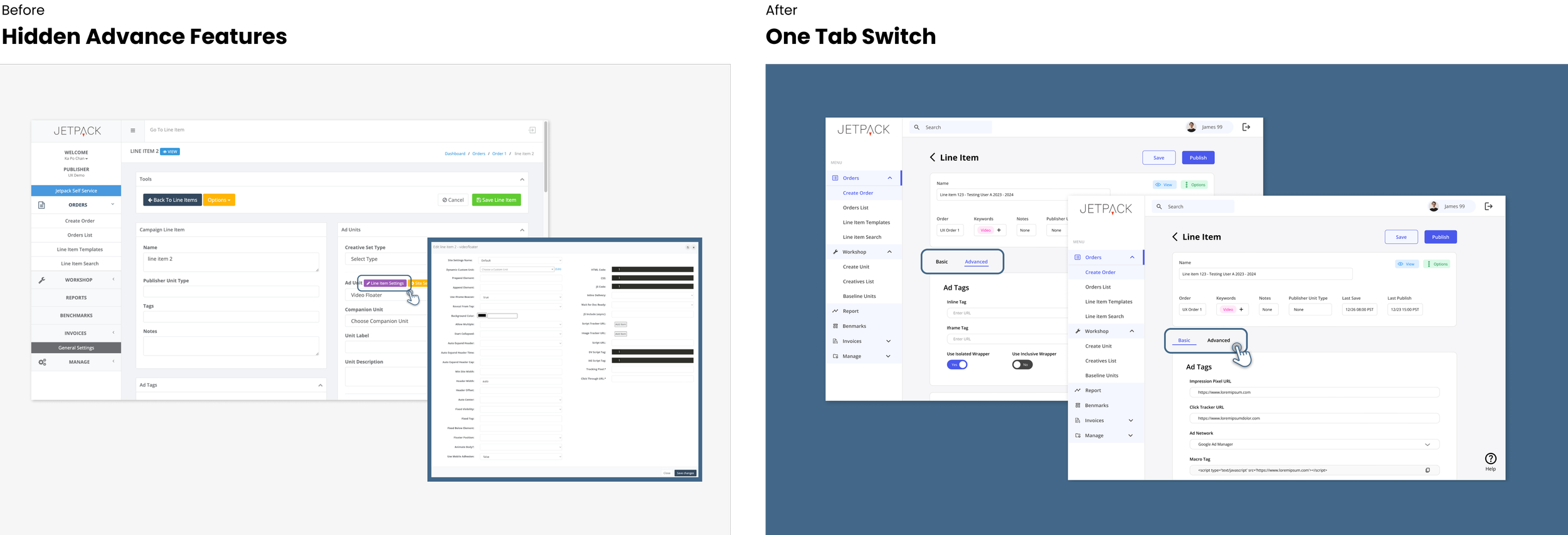
Now users can visit the Advanced Features by switching between two features:
Basic Features Tab: Set as the default tab, this section was designed to house essential information and frequently used functions, significantly improving user access to critical features right upon page entry.
Advanced Features Tab: Specifically created for less frequently used features, catering to users with specialized needs.
2. One Tap Switch
According to users’ needs and daily workflow, I reorganized the information architecture on the basic (default) page, making it easily navigable and reducing cognitive load.
3. Reorganized Information Architecture
The new workflow and interface were tested with 3 real users to ensure the design effectively addressed the initial problems. User feedback was instrumental in refining the design further:
User Testing
After 2 users indicated that the progress bar felt disconnected from their workflow, I removed the progress bar and introduced a 'save' feature, allowing users to pause their work and return to it at their convenience, thus offering greater flexibility in the content creation process.
1. Progress Bar Removal
Following user insights that most line items were created from templates, I set 'from template' as the default creation process, reducing user effort and decision-making time. For those who would like to create from blank, I also include “blank” in the dropdown menu.
2. Template-Based Creation
Advanced users, such as developers, provided feedback on the preferences of accessing specific features instantly. To solve this, I implemented a floating menu, enabling quick access to different sections without excessive scrolling.
3. Floating Menu
Final Outcome
The Impact
The design has received enthusiastic approval from executives since it addresses users' needs in three significant ways:
Journey Reflections
Listen to the users as they are the ones who utilize the products daily. They have a better understanding of their needs and can provide valuable feedback regarding the platform's functionality.
Communicate effectively while working with cross-functional teams. This involves being prepared to explain and sometimes persuade the design decisions to stakeholders from different backgrounds.


